Archive.
Twenty years of range. Brand, print, digital, and data work, kept on purpose.
8 pieces
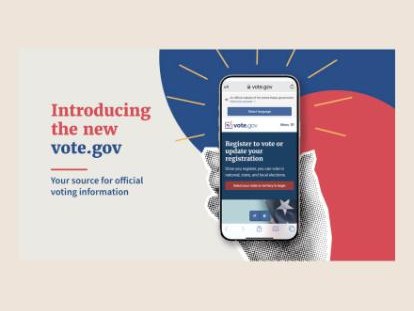 DigitalIntroducing the new Vote.gov
Launch graphic for the Vote.gov redesign.
More about this
Since its launch in 2016, Vote.gov has been known as a trusted source for accurate, official voting information from the U.S. government. We gave the site a new look with improved accessibility features and expanded information based on questions we heard from voters. Vote.gov is now available in 19 languages, covering 96% of the American public, with more on the way.
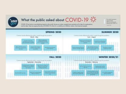 Data vizWhat the public asked about COVID-19
A year of the public’s questions to USAGov, season by season.
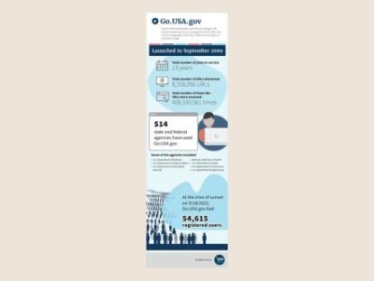 Data vizGo.USA.gov, by the numbers
An infographic marking the sunset of the government’s URL shortener.
More about this
The digital landscape has changed significantly since we launched the Go.USA.gov service in 2009. Over two years the team looked carefully at the program as a whole, considering its future, the current landscape for shortened URLs, and alignment with strategic business goals. In early 2022 we made the difficult decision to sunset the service. The Go.USA.gov URL shortener was retired on September 18, 2022, and this infographic shares the final statistics on its overall usage.
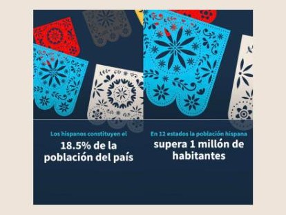 IllustrationHispanic Heritage Month
A Spanish-language social series for USAGov en Español.
 DigitalRegister to vote
Social graphic for Vote.gov.
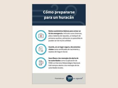 PrintCómo prepararse para un huracán
Spanish-language hurricane preparedness tips for USAGov en Español.
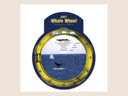 PrintBMT Whale Wheel
A die-cut whale-watching wheel for BMT.
More about this
I designed an engaging physical product called the Whale Wheel, with a window and a rotating disc that lets people explore different whale species, their habitats, and migration patterns. My role covered the whole design process, from concept to execution. I worked closely with vendors to ensure the product’s feasibility and quality, and I created the detailed whale illustrations. The Whale Wheel is both a visually appealing piece and an interactive tool for understanding and appreciating marine life.
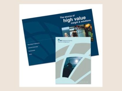 PrintBMT Designers & Planners pocket folder
Award-winning pocket folder and insert.
More about this
This pocket folder was designed within newly set brand guidelines. I was responsible for the design and vendor coordination, including press checks and die design. This project won the Graphic Design USA In-House Design Award.
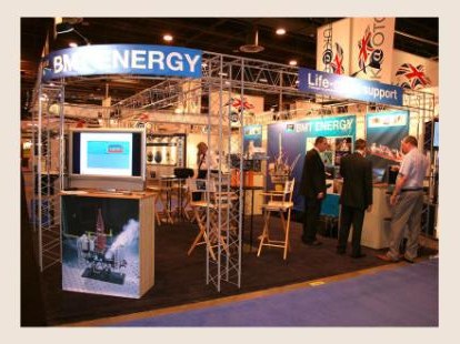 BrandBMT Designers & Planners OTC booth
Booth graphics for the 2006 OTC conference.
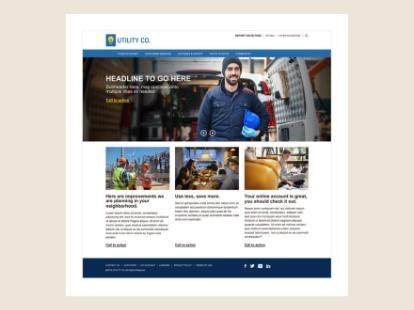 DigitalUtility website template
A customizable homepage for utility clients.
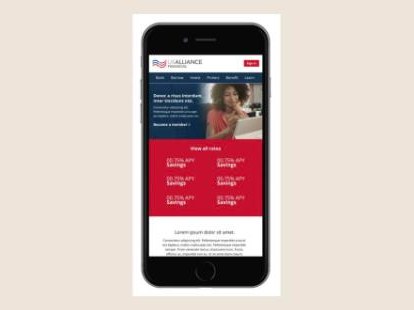 DigitalUS Alliance Financial
Mobile design for a financial institution.
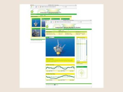 DigitalIndependent Remote Monitoring System
A monitoring dashboard for offshore platforms.
More about this
I designed the user interface for an independent remote monitoring system that supports worker well-being by tracking the conditions that affect safety and performance in real time, without constant in-person check-ins. I worked closely with engineering so the interface fit with advanced sensors and monitoring protocols, translating complex data into an intuitive dashboard with clear layouts and streamlined alerts that support both worker autonomy and safety.
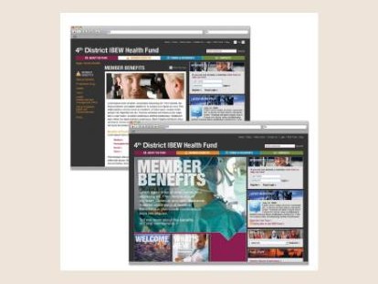 Digital4th District IBEW Health Fund
A member benefits website.
More about this
This website won an APEX Award in the Most Improved Web and Intranet Sites category for NECA’s 4th District Health Fund, 2010.
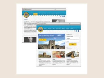 DigitalHungerford Family Foundation website
Website design for a family foundation.
 BrandHungerford Family Foundation
Seal and identity.
More about this
The Hungerford Family Foundation asked for a logo and a website. Devoted to education about the Hungerford family and related surnames, they wanted their family crest in the designs. As a private foundation funded by family, individuals, and corporations, the brand needed to read as trustworthy, stately, and a sound investment. A seal built from the family crest, paired with a beautiful serif typeface, carries those qualities, and the finished logo inspired the website redesign. For the site I handled the information architecture, wireframes, and design. I restructured the navigation and layout so people of every audience and age could use it easily, and instead of the sitemap the client asked for, I created a stacked navigation in the footer that’s far easier to find and use. A wave at the top, rather than a hard line, adds dimension and mirrors the edge of the seal. The client wanted member login and search to be prominent: search is what most people come for, and login signals the benefits of membership. Since the foundation relies on donations, I gave giving a sizable place on the homepage, and highlighted the scholarship fund, which deserved the attention.
 BrandFarm Dog
Logo identity and website for a Rhode Island cover band.
More about this
Farm Dog is a classic rock cover band from Southern Rhode Island. Not your average cover band, they love to play the B sides, and have even taken requests on the spot that they’d never rehearsed. Their wheelhouse is upwards of 200 songs, with favorites from Frank Zappa, Neil Young, Pink Floyd, Led Zeppelin, and Jethro Tull. They wanted a rebrand that fit their newly blooming personality, after a new bass player changed the overall feel of the band. The logo was designed with plenty of feedback and guidance from the band members. From there it was on to the website: a tie-dye style background befitting their music and their fans, with a schedule of shows, photos, and links to their social media. It brings who they are and how to reach them into one place.
 BrandunWined
Logo designed to look like a wine-bottle label.
More about this
The unWined logo was designed to resemble a small label on a wine bottle. With vines and wine-grape colors, it fits the company perfectly.
 BrandUtilico
A sample utility brand for marketing products.
More about this
My team needed a way to market products without associating them with our company brand. I created Utilico, a sample utility company for showing our products in a real-life setting.
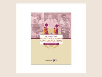 PrintInternational Babywearing Conference
Program cover for the 2012 conference in Washington, DC.
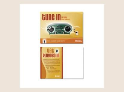 PrintTune in, get plugged in
Direct mail campaign for the Alexandria Chamber of Commerce.
More about this
The Chamber came to me looking to increase its membership. I suggested a direct mail campaign, so they could reach the specific companies they had in mind and tailor their image and message to spark curiosity. This is one of the postcards I designed and wrote copy for.
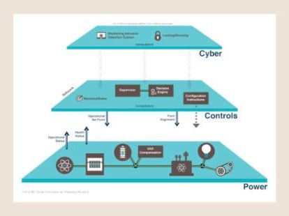 IllustrationCyber, controls, power
A layered systems diagram.
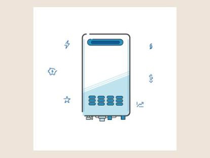 IllustrationWater heater
Product illustration with supporting icons.
 IllustrationSeesaw
Character illustration.
 IllustrationBalloon
Character illustration.
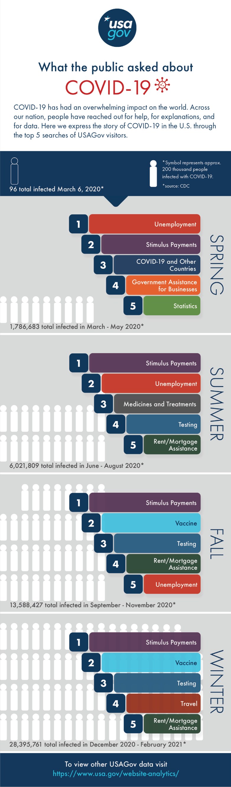
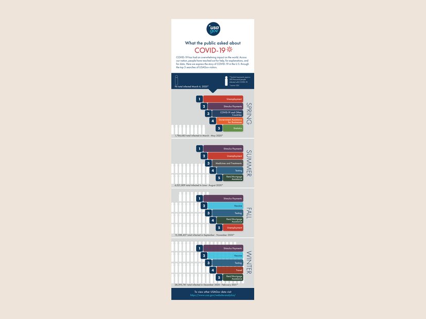 Data vizWhat the public asked about COVID-19
The top five USAGov searches for each season of the pandemic, spring 2020 to winter 2021. View full size
More about this
COVID-19 has had an overwhelming impact on the world. Across our nation, people have reached out for help, for explanations, and for data. Here we express the story of COVID-19 in the U.S. through the top 5 searches of USAGov visitors.
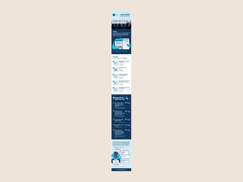 Data vizInsights & Highlights, USAGov en español
Quarterly infographic on what people asked the government in Spanish, July to September 2023. View full size
More about this
Insights and Highlights is a quarterly infographic series designed to track and visualize USAGov user behavior trends. See the Insights & Highlights case study.
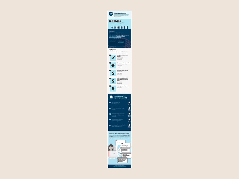 Data vizInsights & Highlights, July to September 2022
The quarterly USA.gov user-behavior infographic, midterm election edition. View full size
More about this
Insights and Highlights is a quarterly infographic series designed to track and visualize USAGov user behavior trends. See the Insights & Highlights case study.
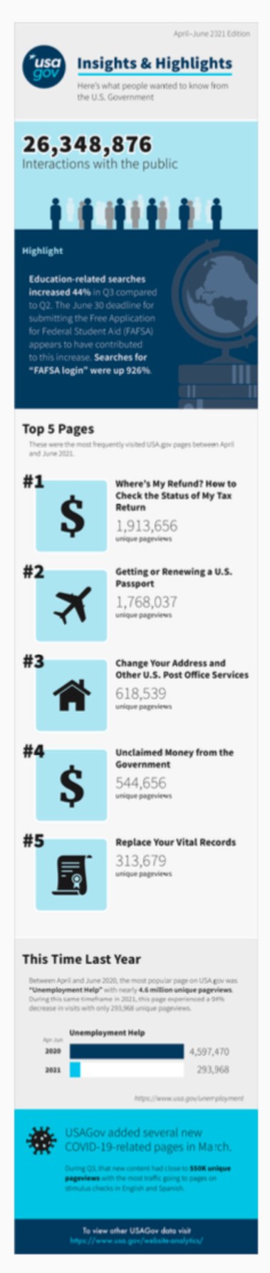
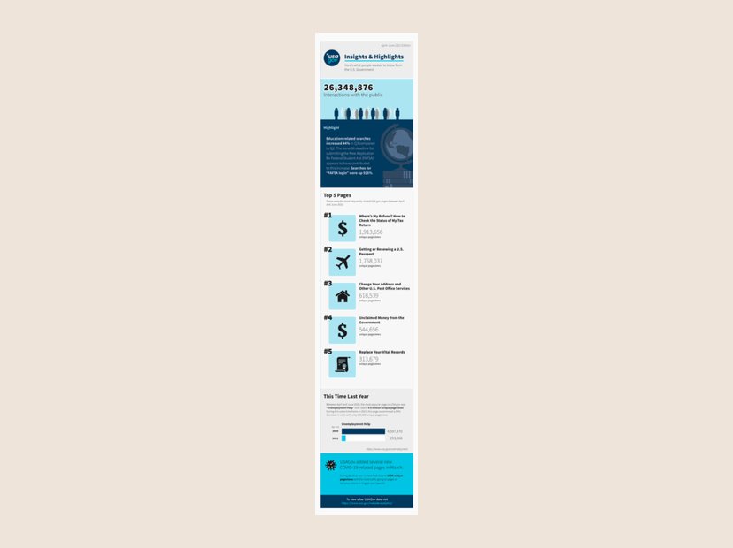 Data vizInsights & Highlights, April to June 2021
An early edition, with a this-time-last-year comparison. View full size
More about this
Insights and Highlights is a quarterly infographic series designed to track and visualize USAGov user behavior trends. See the Insights & Highlights case study.
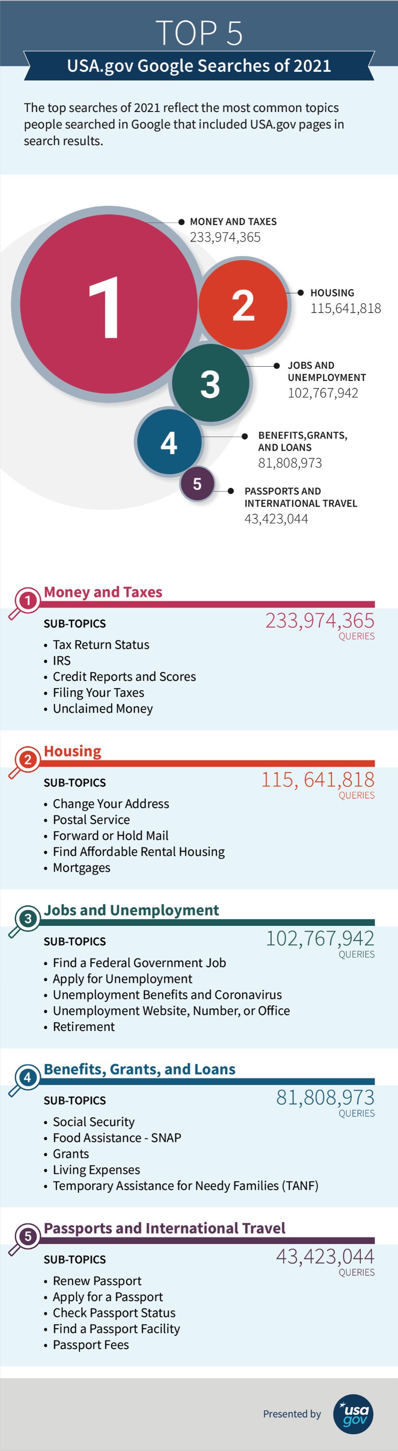
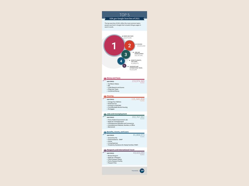 Data vizTop 5 USA.gov Google searches of 2021
The most common topics people searched that surfaced USA.gov pages, with subtopics. View full size
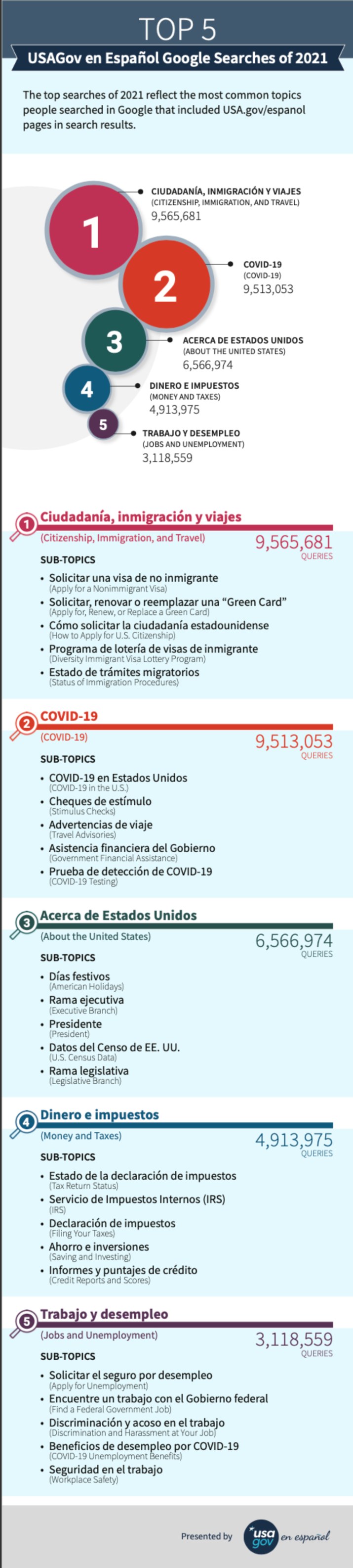
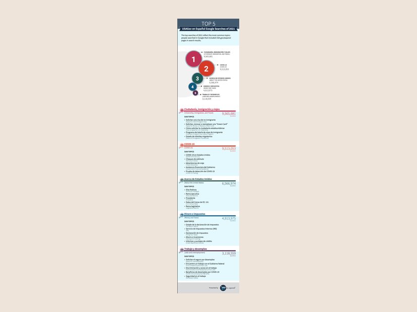 Data vizTop 5 USAGov en Español searches of 2021
The Spanish-language edition, with English translations for every subtopic. View full size
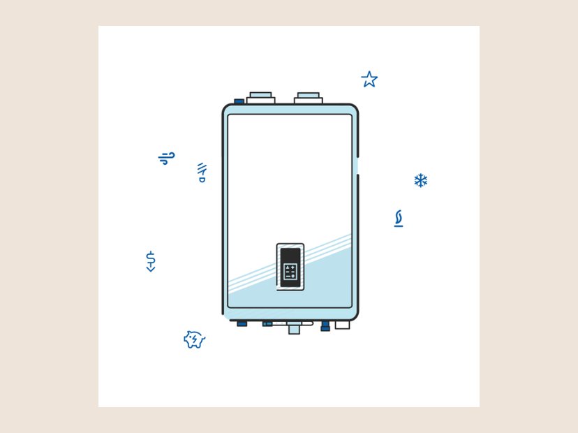 IllustrationWater heater illustration
Line illustration for an energy-efficiency program.
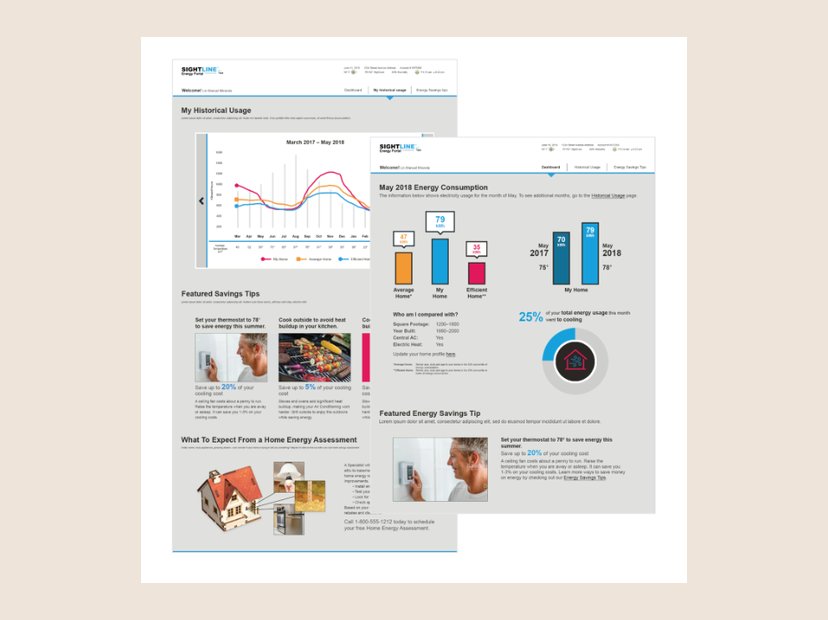 DigitalSightline energy portal
Customer portal screens: historical usage, monthly consumption, and savings tips.
More about this
I designed an energy portal product from the ground up, focused on an intuitive experience built on custom data integration. It’s a central hub where people see real-time energy use, performance metrics, and personalized insights. Working closely with engineering, I made sure the portal brought diverse data sources together into one clear view of each household’s patterns. I created the user flows and wireframes, prioritizing function while keeping the interface engaging, so people can make informed decisions about their energy use.
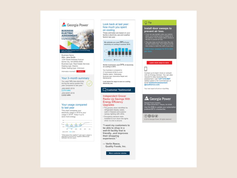 PrintGeorgia Power business energy report
Commercial report with usage comparisons, a testimonial, and savings tips.
More about this
A report for Georgia Power, one of our large utility clients, for a small-business energy report program. Like home energy reports, it’s designed to make business owners aware of their energy use. It reads as a single piece, but I designed and built it to be modular. My work covered branding and product design: a new product type, information visualization, rewards programs, alert and judgment areas, and research and design. The R&D side meant understanding how each element worked, including the engineering and the data streams utilities collect.
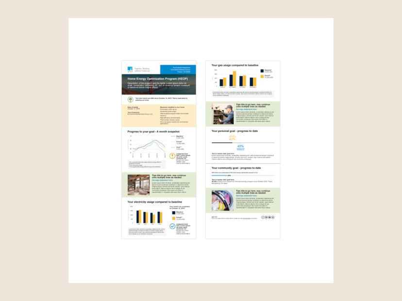 PrintHome Energy Optimization Program report
Report template tracking a household against its baseline and goals.
More about this
I designed a home energy report template for electric companies using XMPie’s data integration with Adobe InDesign, so we could produce thousands of fully customized reports, each tailored to one customer. I built a layout that was dynamic yet standardized: XMPie filled each section with the customer’s own energy use, cost-saving recommendations, and next steps. Utilities could speak personally to very large customer groups while keeping one efficient process for mass distribution, and every report was unique without compromising design consistency or quality.
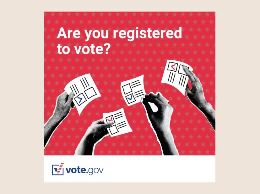 DigitalAre you registered to vote?
Vote.gov social graphic.
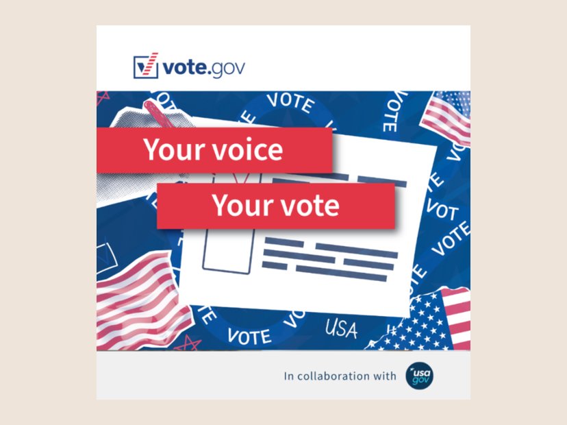 DigitalYour voice, your vote
Vote.gov social graphic, in collaboration with USAGov.
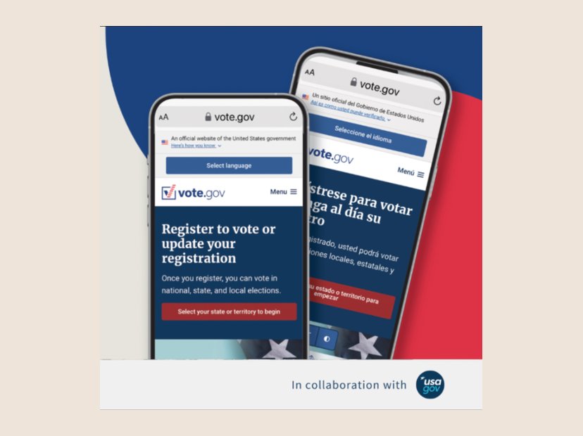 DigitalRegister or update your registration
Vote.gov social graphic showing the English and Spanish sites.
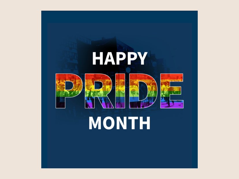 DigitalHappy Pride Month
Instagram graphic for USAGov.
More about this
For USAGov we wanted a Happy Pride Month Instagram graphic. I used the classic rainbow and an original photo from the first Pride march in New York on June 28, 1970.
 DigitalNational Voter Registration Day
Vote.gov takeover of the USAGov Instagram, 2024.
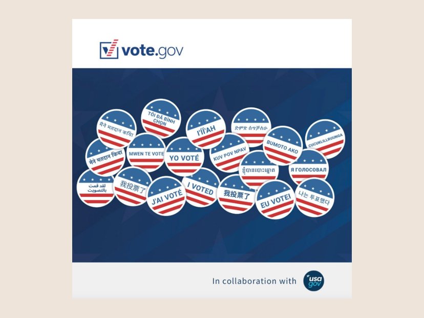 DigitalI voted, in many languages
Part of the same 2024 Instagram takeover.
 Digital#ListoParaVotar
Vote.gov social graphic for Spanish-speaking voters.
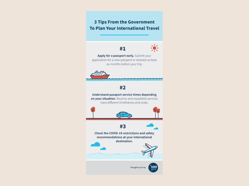 Illustration3 tips to plan international travel
Illustrated USAGov social infographic. View full size
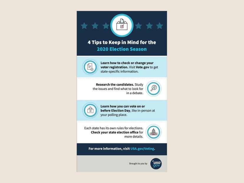 Digital4 tips for the 2020 election season
USAGov social infographic.
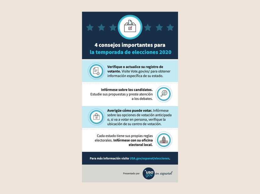 Digital4 consejos para las elecciones 2020
The Spanish edition of the election-season tips.
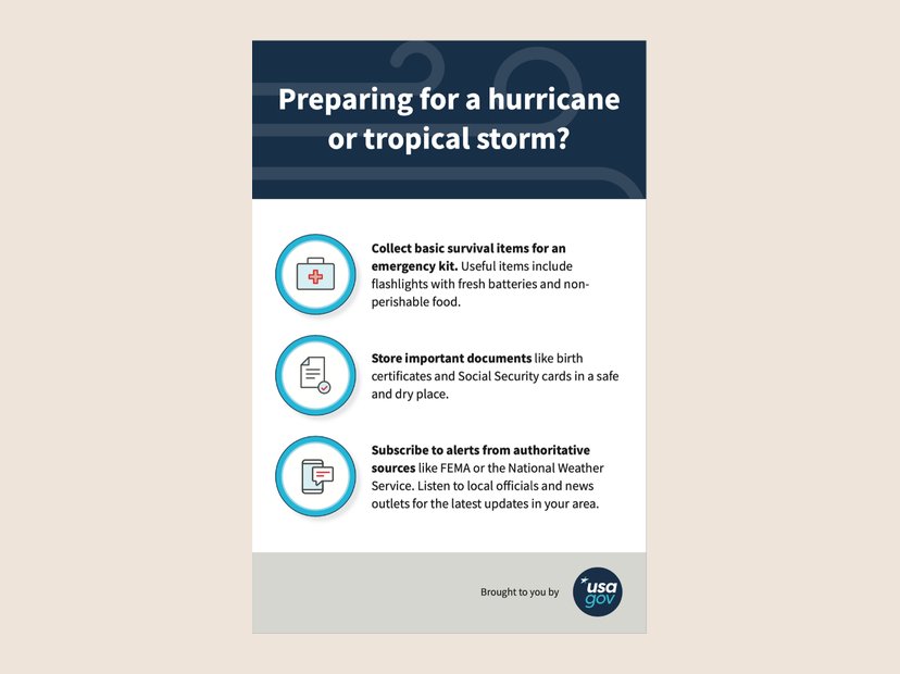 DigitalPreparing for a hurricane
USAGov emergency-preparedness social graphic.
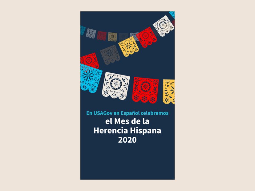 IllustrationMes de la Herencia Hispana 2020
Story graphic for USAGov en Español.
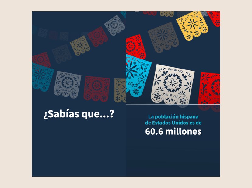 Data viz¿Sabías que...?
Hispanic Heritage Month facts series for USAGov en Español.
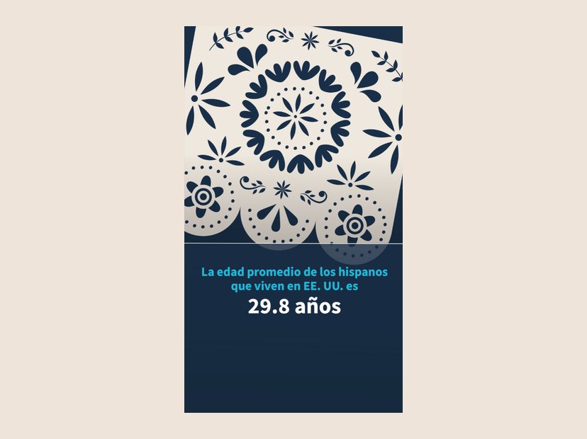 Data viz29.8 años
From the same Hispanic Heritage Month series.
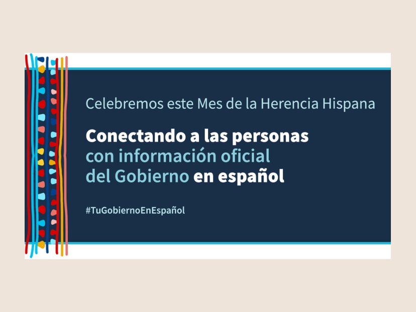 DigitalHispanic Heritage Month banner
Social banner for USAGov en Español.
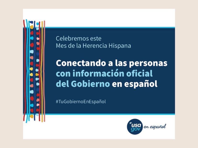 DigitalHispanic Heritage Month graphic
Companion social graphic for USAGov en Español.
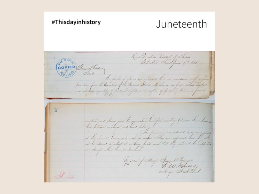 DigitalJuneteenth
#Thisdayinhistory Instagram graphic for USAGov.
More about this
This Juneteenth graphic was created using pieces of an original declaration.
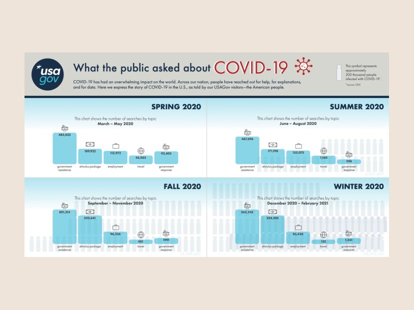 Data vizCOVID-19 searches by season
Landscape version of the COVID-19 infographic, charting searches by topic.
More about this
COVID-19 has had an overwhelming impact on the world. Across our nation, people have reached out for help, for explanations, and for data. Here we express the story of COVID-19 in the U.S. through the top 5 searches of USAGov visitors.
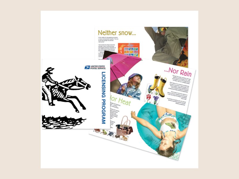 PrintUSPS Licensing Program booklet
Product marketing booklet for the U.S. Postal Service.
More about this
I developed a marketing book for USPS that showcases a diverse range of products made from stamp art. It was designed to highlight the versatility of the artwork, showing how it can be used and licensed by product merchants across many industries. By curating a collection of creative applications, from home décor to stationery, I aimed to inspire potential partners while giving them a complete resource on the artistic and commercial value of stamp art.
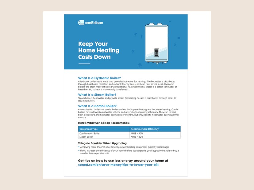 PrintCon Edison boiler fact sheet
Home-heating fact sheet for Con Edison customers.
More about this
A fact sheet I designed for Con Edison with information about boilers. I also drew the illustration.
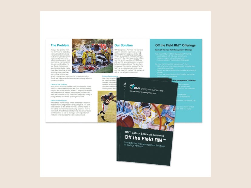 PrintOff the Field RM brochure
Risk-management brochure for BMT Designers & Planners.
More about this
The BMT Designers & Planners Safety Services Division wanted promotional material to hand out at conferences and after training sessions, to raise its visibility and tell clients about its services. This trifold brochure was eye-catching and informative, and helped the group meet that goal.
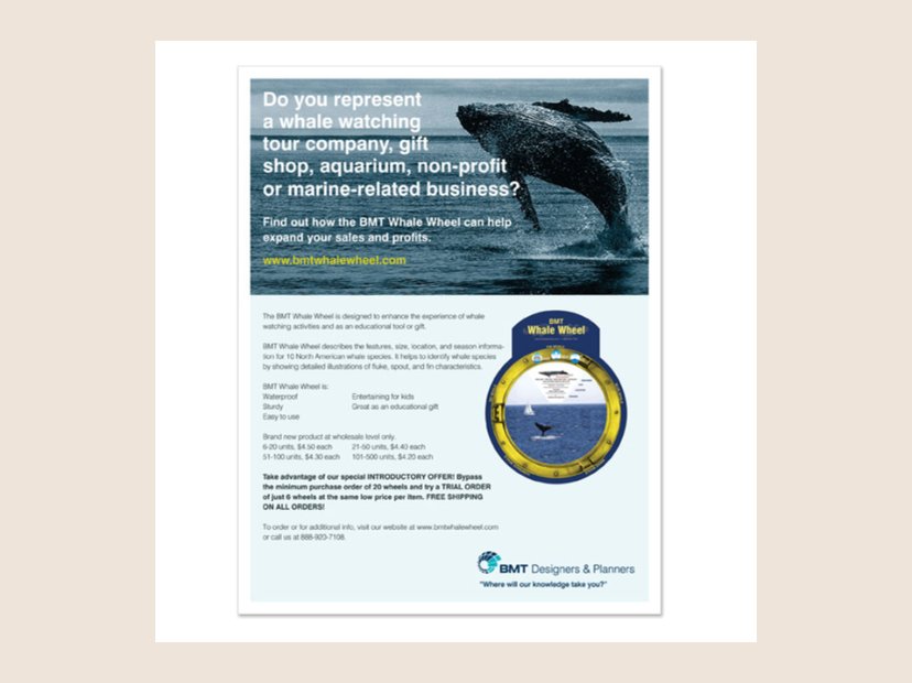 PrintBMT Whale Wheel sell sheet
Wholesale sell sheet for the BMT Whale Wheel.
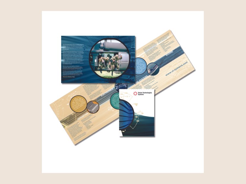 PrintVision Technologies Systems brochure
Capabilities brochure.
 BrandTetreault Metal Works
Logo and T-shirt design.
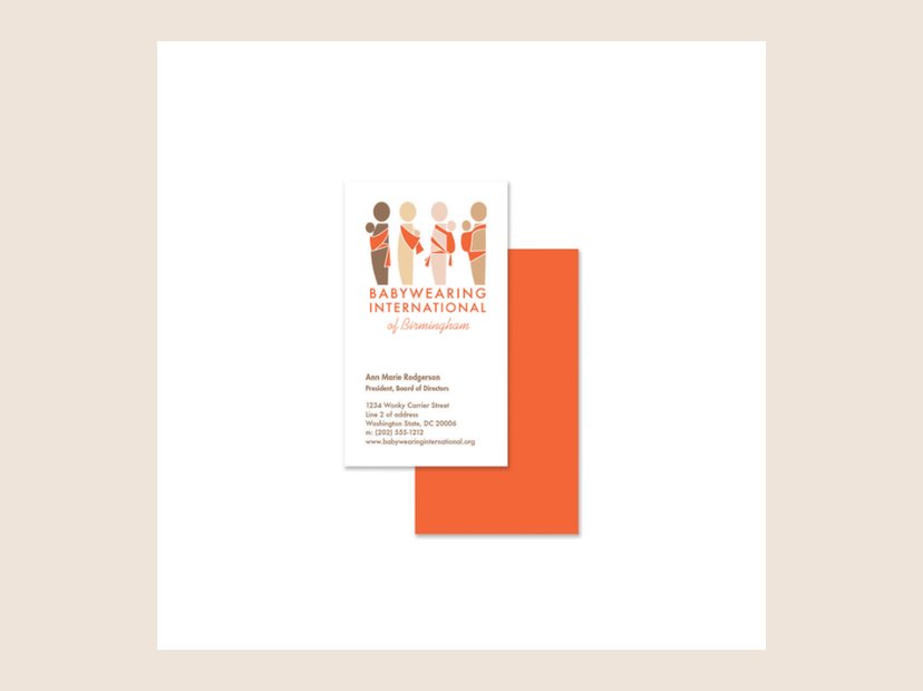 BrandBabywearing International business cards
Business cards for the Birmingham chapter.
More about this
Babywearing International is a nonprofit whose mission is to promote babywearing as a universally accepted practice, with benefits for both child and caregiver, through education and support. The goal of the identity work was to strengthen their brand and, with it, their ability to win funding. The first step was a universal logo for all of the chapters, plus a business card for leaders to hand out at meetings. Babywearing International also asked me to redesign their website, and I provided some of the photography.
 BrandRollins PCI Construction
Logo design.
More about this
Rollins PCI is a general contracting and construction management company based in Maryland. Two companies, Rollins and PCI, were joining as one and needed a rebrand. They wanted a logo that expressed the merger and a solid bond, while showing they started as separate entities. Because they are known for building, not just renovating interiors, I showed two overlapping buildings between the two names. I chose the primary typeface because it is modern yet sturdy, two important traits for a company that builds. The sans serif word “construction” works as a foundation for the logo, grounding it and tying back to the building theme. I also designed the letterhead, business cards, and website.
 BrandFarm Dog trucker hat
The Farm Dog logo on merch.
 BrandFEDPAC
Logo design.
 BrandAlexMap
Logo design.
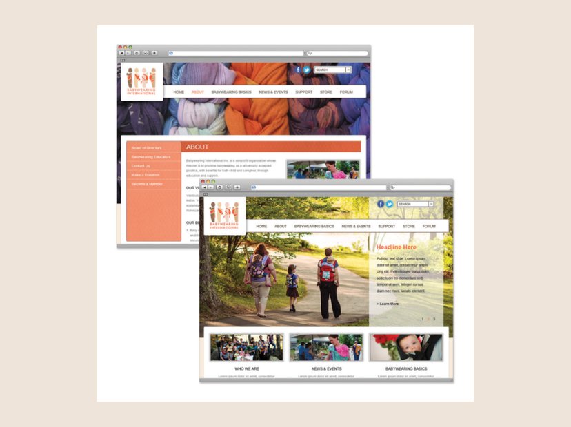 DigitalBabywearing International website
Website redesign for the nonprofit, alongside its new identity.
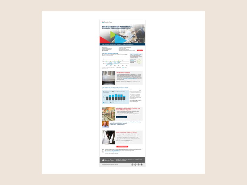 DigitalGeorgia Power business energy email
Email edition of the business energy report.
More about this
I designed a home energy report template for electric companies using XMPie’s data integration with Adobe InDesign, so we could produce thousands of fully customized reports, each tailored to one customer. I built a layout that was dynamic yet standardized: XMPie filled each section with the customer’s own energy use, cost-saving recommendations, and next steps. Utilities could speak personally to very large customer groups while keeping one efficient process for mass distribution, and every report was unique without compromising design consistency or quality.
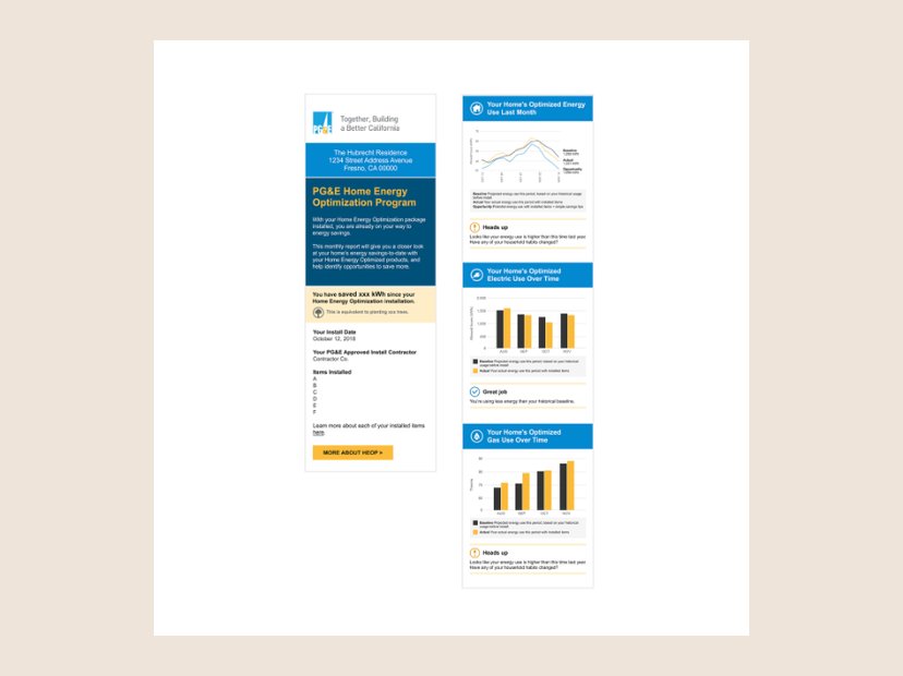 DigitalPG&E Home Energy Optimization report
Mobile report tracking savings against each home’s baseline.
More about this
I designed a home energy report template for electric companies using XMPie’s data integration with Adobe InDesign, so we could produce thousands of fully customized reports, each tailored to one customer. I built a layout that was dynamic yet standardized: XMPie filled each section with the customer’s own energy use, cost-saving recommendations, and next steps. Utilities could speak personally to very large customer groups while keeping one efficient process for mass distribution, and every report was unique without compromising design consistency or quality.
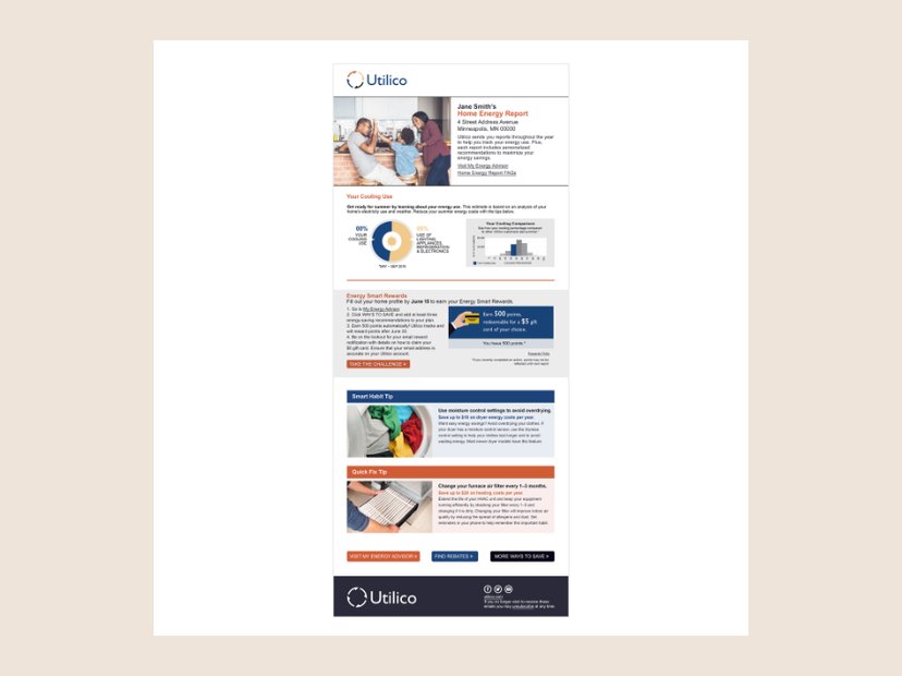 PrintSample home energy report
A Utilico-branded report used to market the product.
More about this
I designed a home energy report template for electric companies using XMPie’s data integration with Adobe InDesign, so we could produce thousands of fully customized reports, each tailored to one customer. I built a layout that was dynamic yet standardized: XMPie filled each section with the customer’s own energy use, cost-saving recommendations, and next steps. Utilities could speak personally to very large customer groups while keeping one efficient process for mass distribution, and every report was unique without compromising design consistency or quality.
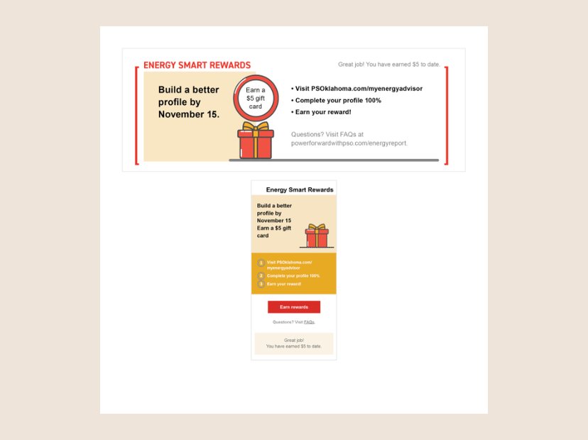 DigitalPSO Energy Smart Rewards
Rewards module for print and mobile reports.
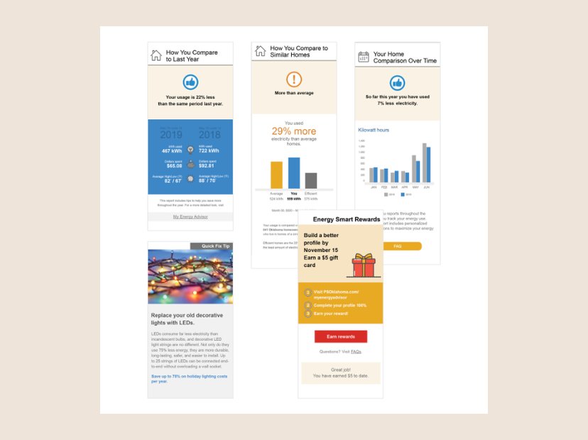 DigitalMobile home energy report modules
Comparison, rewards, and tip modules for phone screens.
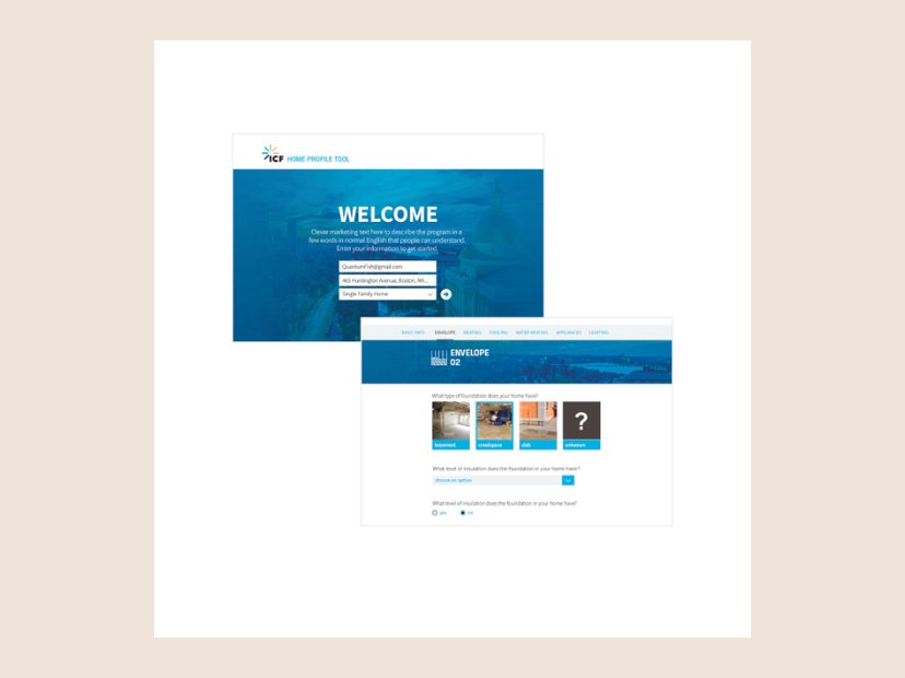 DigitalHome Profile Tool
A tool for homeowners to assess their homes for energy upgrades.
More about this
I designed this home profile tool from scratch to help homeowners evaluate their homes for energy-efficiency upgrades. It gives a detailed assessment of the home, inside and out, highlights improvements that could raise performance and cut costs, and keeps the home’s energy data in one place so people can track progress over time. A social feature connects neighbors, encouraging conversations about efficiency and collective action on local sustainability goals.
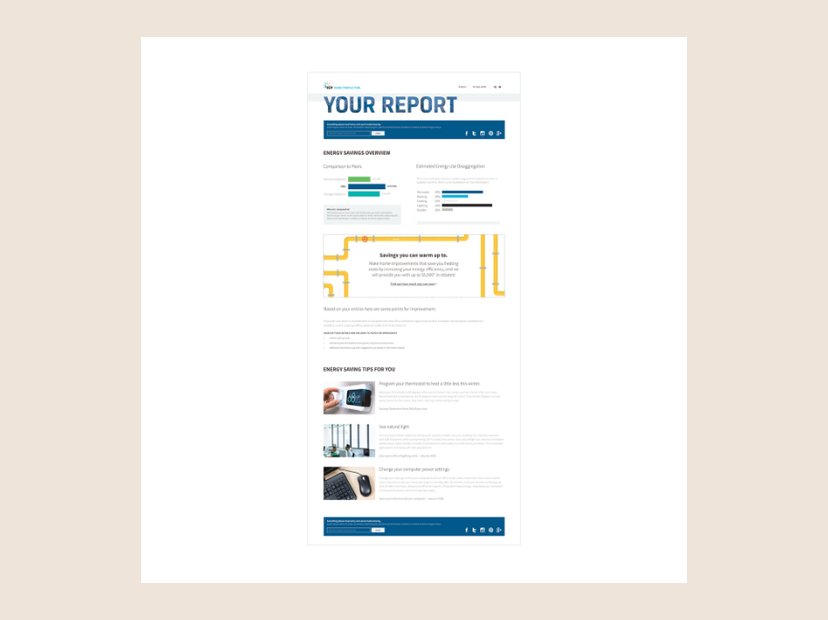 DigitalHome Profile Tool report
The personalized report the Home Profile Tool generates.
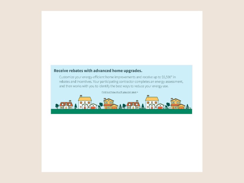 IllustrationEnergy rebate ad
Illustrated web ad for home-upgrade rebates.
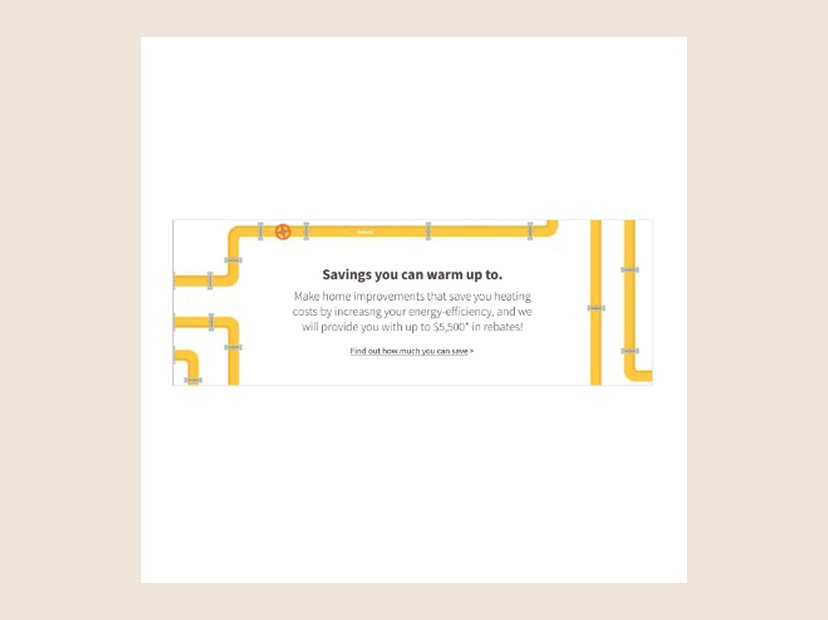 IllustrationEnergy savings ad
Illustrated web ad for heating-efficiency savings.
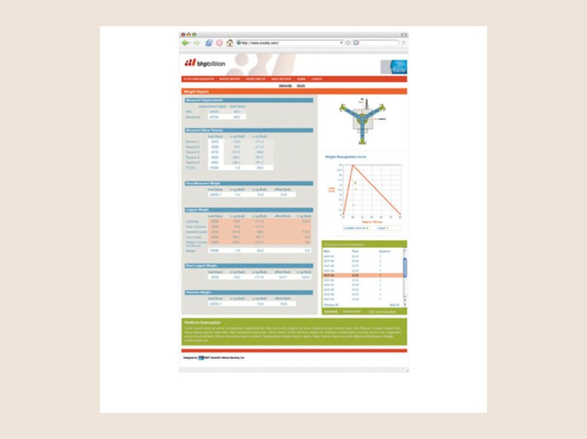 DigitalBHP Billiton remote monitoring
Dashboard for an independent remote monitoring system.
More about this
I designed the user interface for an independent remote monitoring system that supports worker well-being by tracking the conditions that affect safety and performance in real time, without constant in-person check-ins. I worked closely with engineering so the interface fit with advanced sensors and monitoring protocols, translating complex data into an intuitive dashboard with clear layouts and streamlined alerts that support both worker autonomy and safety.
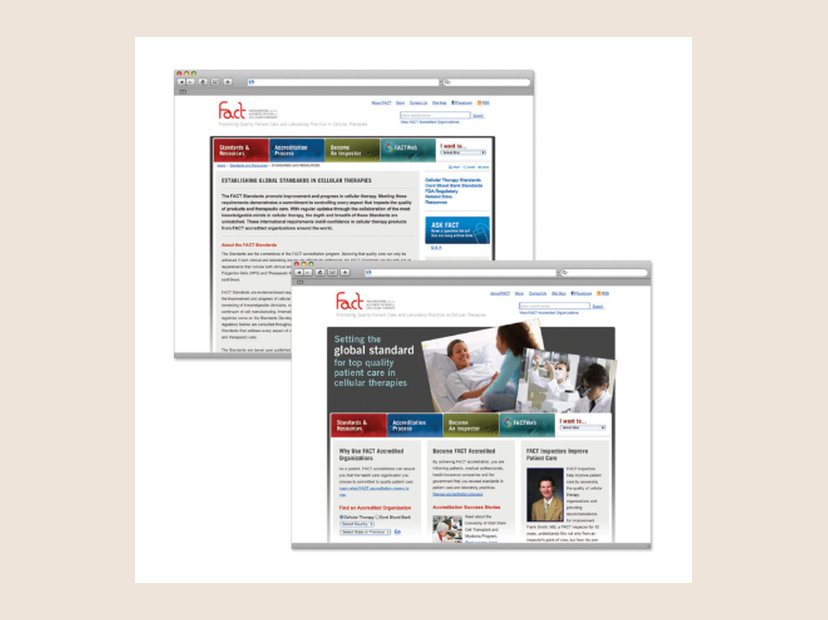 DigitalFACT website and accreditation portal
Award-winning site for the Foundation for the Accreditation of Cellular Therapy.
More about this
Founded in 1995, FACT sets standards for high-quality medical and laboratory practice in cellular therapies. It’s a nonprofit co-founded by the International Society for Cell and Gene Therapy and the American Society for Transplantation and Cellular Therapy for voluntary inspection and accreditation. I designed their website and accreditation portal with a team of engineers. It won an Interactive Media Awards Best in Class in the Health category, and a Web Marketing Association Standard of Excellence award in both Biotechnology and Technology, all in 2011.
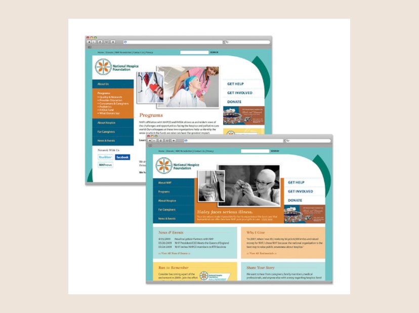 DigitalNational Hospice Foundation website
Website redesign.
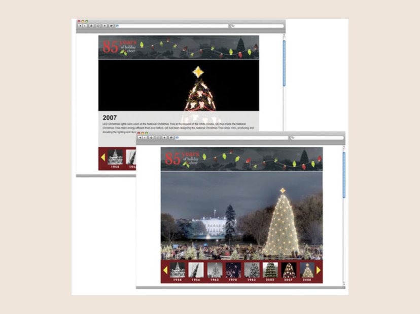 DigitalNational Christmas Tree timeline
Interactive 85-year timeline for the National Park Foundation.
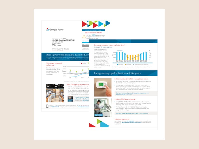 PrintGeorgia Power business energy report
A modular report bringing energy awareness to small businesses.
More about this
A report for Georgia Power, one of our large utility clients, for a small-business energy report program. Like home energy reports, it’s designed to make business owners aware of their energy use. It reads as a single piece, but I designed and built it to be modular. My work covered branding and product design: a new product type, information visualization, rewards programs, alert and judgment areas, and research and design. The R&D side meant understanding how each element worked, including the engineering and the data streams utilities collect.
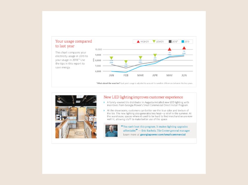 Data vizBusiness energy report modules
A six-month self-comparison chart and a customer success story.
More about this
Two modules for the business energy reports. The first is a historical self-comparison over six months. I worked directly with an engineer, designing and building the charts in R. The increase and decrease symbols come from the client’s brand, specifically its colored triangles. I chose a line chart because it would flex to show 12 months of data, and it balances with the rest of the page, standing out without demanding all the attention. The second is a pull quote from a larger case study about a business’s success with the program. I highlighted the location and the owner, to show a personal connection to the program and put a face to the success.
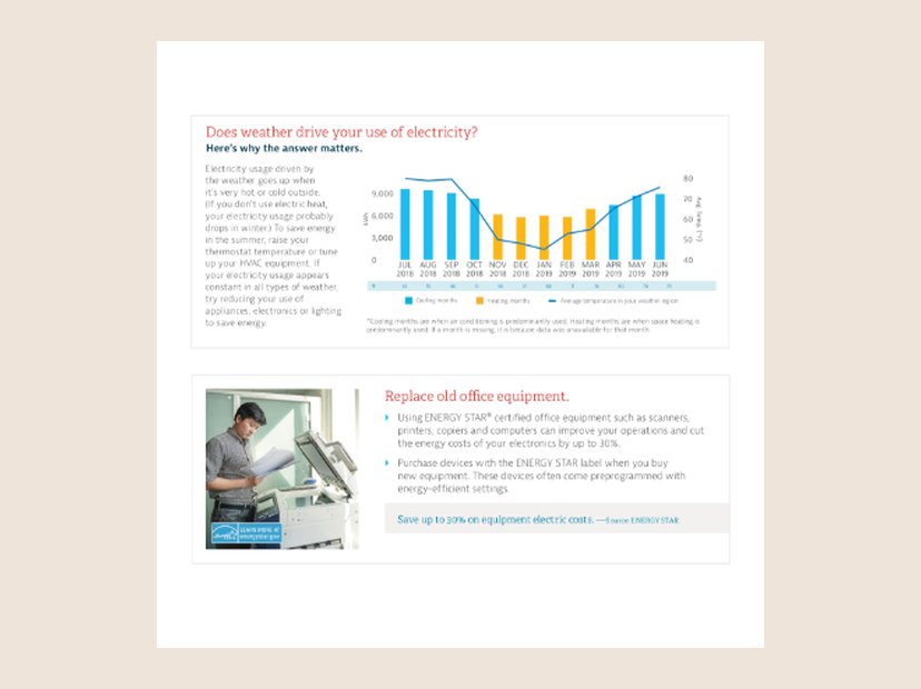 Data vizWeather and energy use module
Usage plotted against temperature, generated for each business.
More about this
Two more modules for the business energy report. The top one asks whether the weather changes how a business uses electricity. Every chart and statement is customized per customer, roughly 30,000 individual versions of each module. In design, it was important to start with stripped-down data: the chart covers kilowatt use, average monthly temperature, months of data, and which months are heating versus cooling. The second is a featured energy-saving tip placed by logic. I wrote a large batch of tips, and placement is customized for each customer.
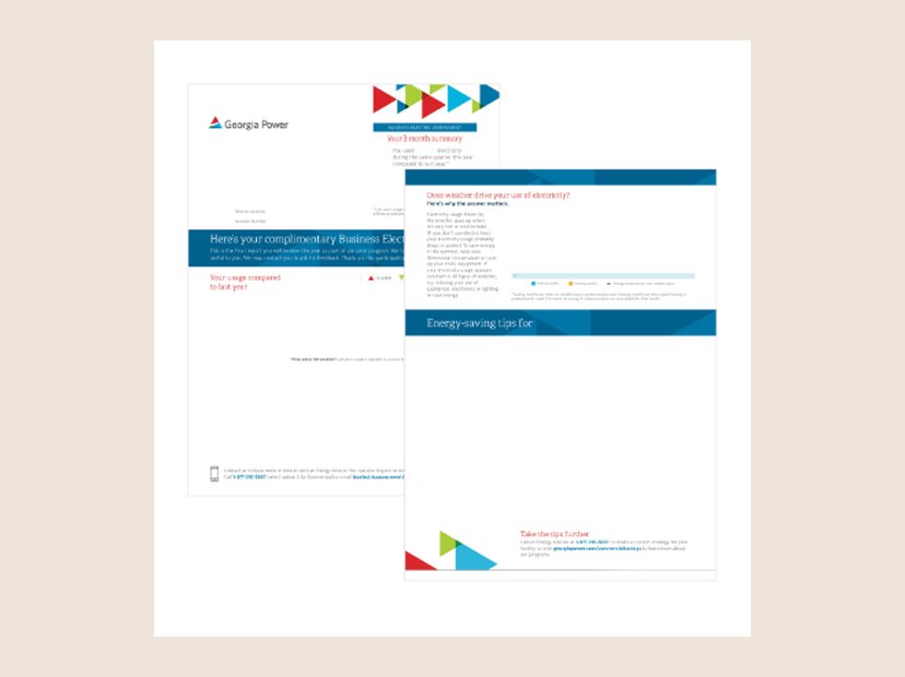 PrintBusiness energy report template
The variable-data map behind the pilot report.
More about this
This business energy program was a pilot. I worked closely with the vendor on variable data placement, building the report almost entirely from dynamically placed data and custom-designed charts. I created a map for the developer to target precise placement, and learned VDP in InDesign to do it.
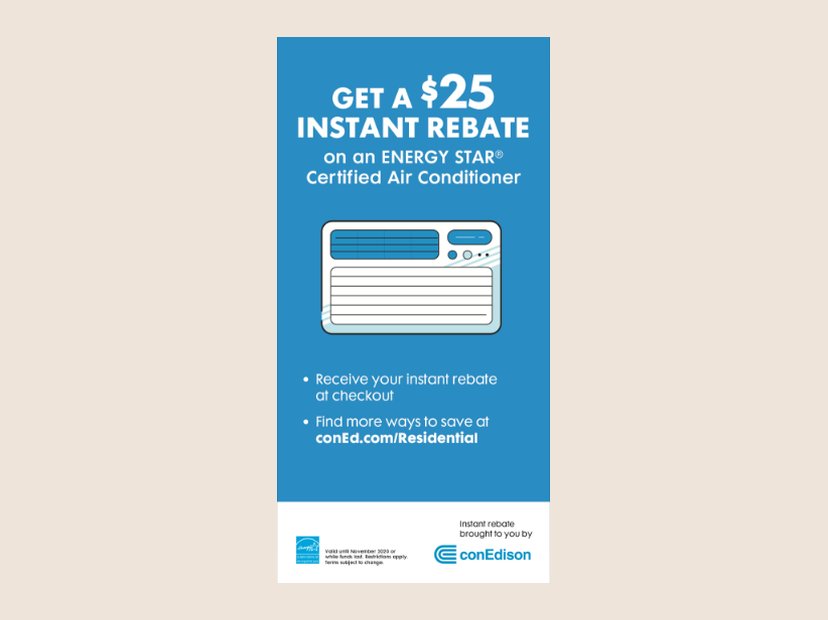 PrintCon Edison air conditioner rebate
In-store sign for an instant rebate.
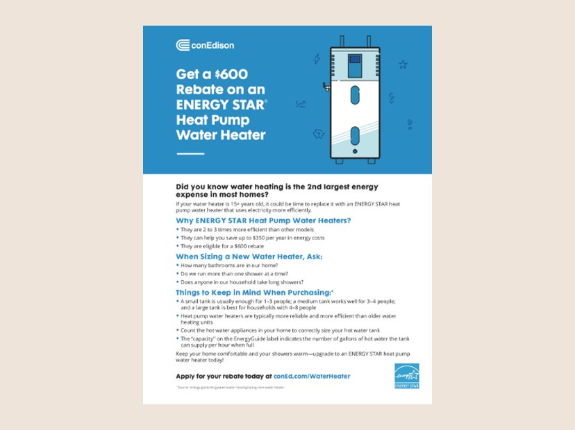 PrintCon Edison heat pump water heater flyer
Rebate flyer with buying guidance.
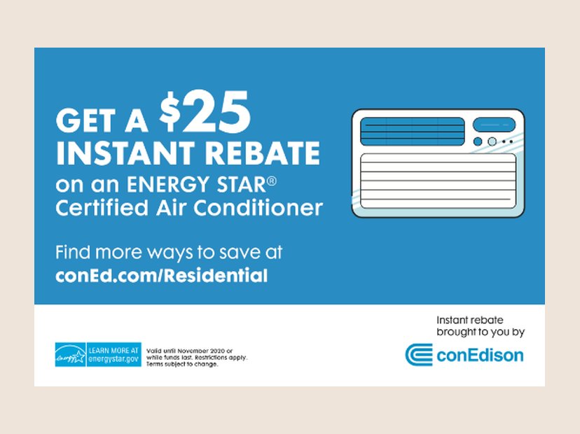 PrintCon Edison rebate banner
Wide format of the air conditioner rebate.
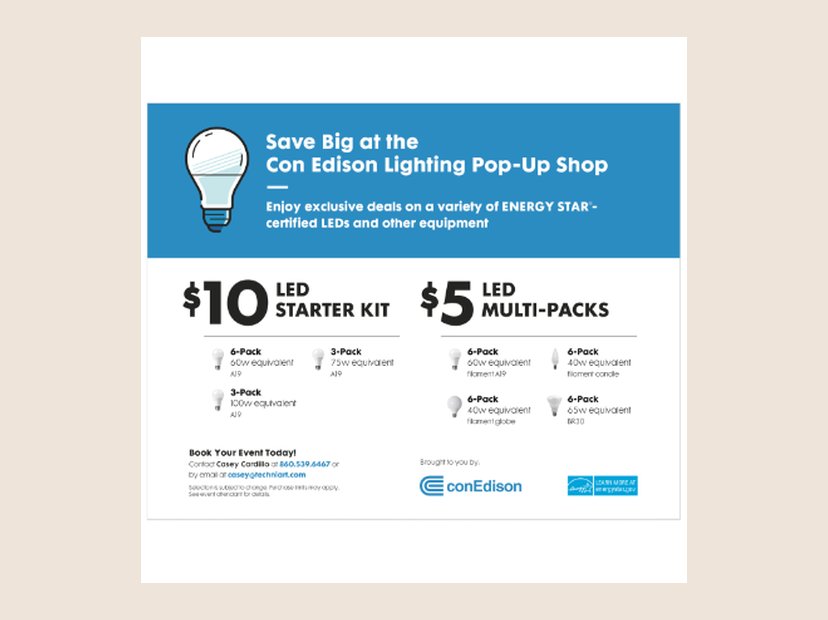 PrintCon Edison Lighting Pop-Up Shop
Event flyer for discounted LED lighting.
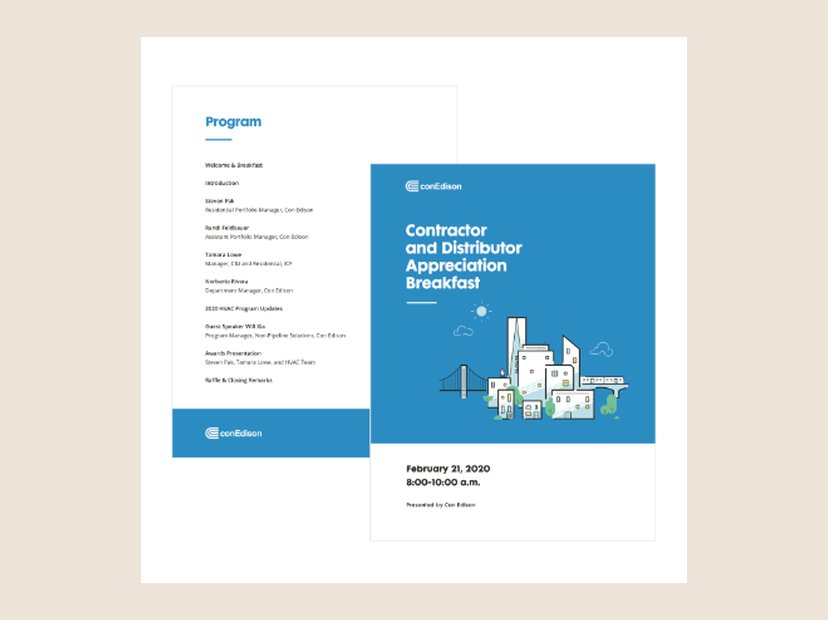 PrintContractor and Distributor Appreciation Breakfast
Event program cover and agenda for Con Edison.
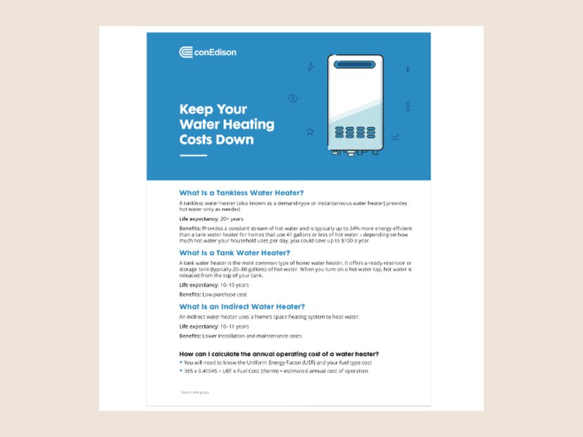 PrintCon Edison water heating fact sheet
Fact sheet comparing water heater types, with my illustration.
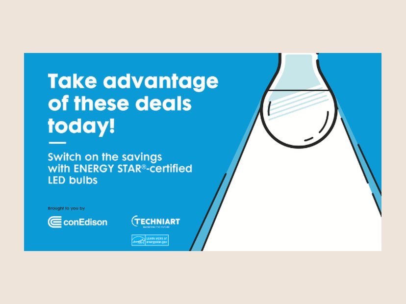 PrintCon Edison LED deals banner
Retail banner for ENERGY STAR LED bulbs.
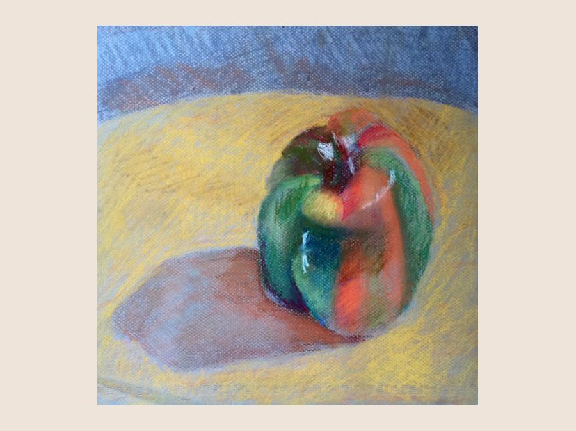 IllustrationPepper
Still life in pastel.
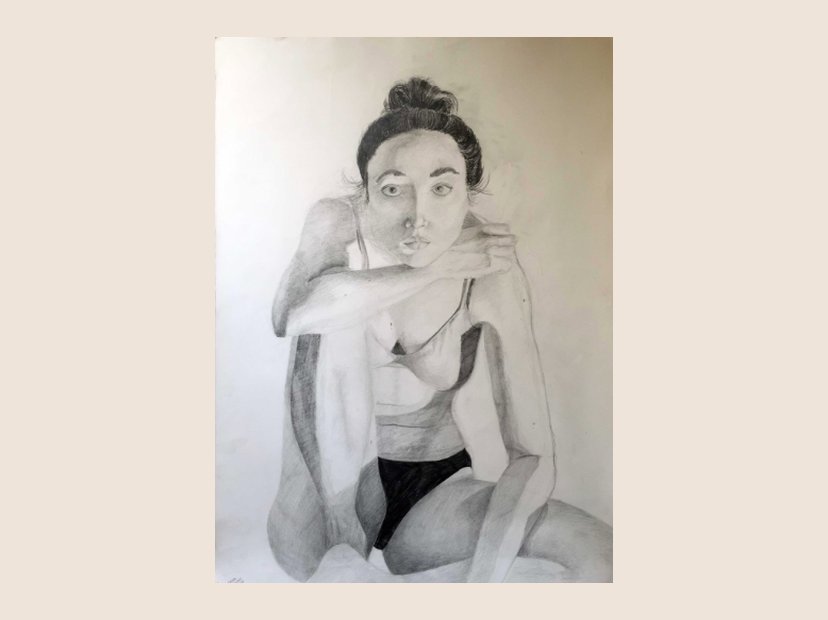 IllustrationSelf portrait
Pencil, 36 by 48 inches.